The Death of Opera 12

[sc:software-category ]I’ve been using Opera 12 as my main browser for years now, but more and more sites are starting to fail with it.

The Chromium based version of Opera is just such a poor substitute that I can’t see myself moving to it.  That means either Firefox or Chrome.

I’ve used Firefox for years and with some add ons it’s a pretty good substitute for Opera 12, but it is a bit of a resource hog and with every version looks more and more like Chrome.

On the other hand I’ve been using Chrome for testing and Google has obviously put a lot of effort in making a technically superb browser, but it is Google 🙁

So the winner is Firefox, but I have to admit there’s no technical reason I can find to prefer it over Chrome.  Sometimes I guess you just have to accept a moral stand as the only reason for choosing one vendor or another 😉

Migrating to Firefox was easy enough, just had to export my bookmarks out from Opera (Firefox has apparently dropped importing from Opera at some point) as HTML and then loaded them in to Firefox.

I did have to setup Firefox Sync again as I haven’t used it since the major update they did a while ago.

I did install a couple of extra add ons:

  • Adblock Plus
  • Bookmarks menu (to get an opera style bookmark menu item back)
  • Download Panel Tweaks (to get rid of the annoying download arrow animation)
  • DuckDuckGo Plus (easy default search setup)
  • Firebug (to replace the Opera debugger)
  • NoScript (I may remove this again, we’ll see)

The only other thing now is to store my passwords in the browser again as I logon to the various sites.
Earin on KickStarter

[sc:hardware-category ]I’ve been watching KickStarter with interest for a while, it’s an interesting site and there was something finally on it that got me to sign up, Earin.

I’ve been using a Jabra Halo set of Bluetooth headphone for quite a while and they do the job, but they are cumbersome to carry around and I’d been looking for a set of inear Bluetooth earphones for a while.

The problem with the ones I had found were that they all had a cord running between the earbudsEarin seems to have solved the problem and I look forward to getting a set early next year.

User Registration Protection for WordPress

[sc:wordpress-category ]When I first started JumbleCat I opened the user registration up to everyone to be able to comment on my posts, however it quickly became flooded with spam registrations.

I implemented a couple of different solutions but after a while it became apparent that reCAPTCHA was a requirement and so I settled on Pie Register.

Pie Register had several big advantages; simple to setup, reCAPTCHA support, additional fields to the registration page, user registration through verification messages and so on.  It worked well and provided very good protection against spam accounts.

Then version 2 of Pie Register was released.  It was a complete rewrite and broke virtually everything.  As I had automatic updates enabled it came down as soon as it was released.  Once installed it:

  • Broke ALL user registration
  • Broke all logins (luckily my admin account was still logged in)
  • It didn’t bring across ANY configuration from version 1
  • The custom form editor didn’t work
  • Registration was required
  • The normal registration and login pages were replaced with a themed version, with no option to go back.
  • The top level menu ignored the theme options and changed the color to a white background with red lettering.  Make it stick out like a sore thumb and looked terrible.

I downgraded back to version 1 and left it for a while to see if the issues would be resolved, while some have been, it’s still just too complex for what I need so I’ve removed it and replaced it with two other plugins.

User Registration Aide

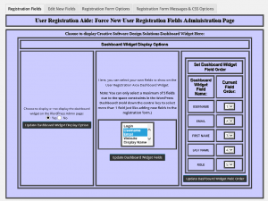
User Registration Aide provides all kinds of features but I’m really only using it for one thing, the addition of my site guidelines to the registration form.  Overall it’s a good plugin and has been working well but I have just two nitpick about it really, the configuration interface looks to be from the 90’s.  Ugly does not begin to describe it:

User Registration Aide

The second is that it adds a top level menu to WordPress instead of sitting under Users or Settings.  I don’t think something that is usually only configured once should intrude at the top level.  Anyway, beside that it does the job.

Better WordPress reCAPTCHA

Better WordPress reCAPTCHA is a great plugin that focuses only on integrating reCAPTCHA in to WordPress.  It’s easy to set up and works well.  The only nitpick I have is the same as for User Registration Aide, it adds a top-level menu to WordPress instead of sitting under Settings.

Closing Thoughts

Between the new plugins I get pretty much everything I had before, however I have lost the two stage registration.  No a big deal hopefully as I never saw any users stuck waiting for confirmation with Pie Register so the bot’s got around it anyway.

I won’t know for a while if the setup works as well as Pie Register did, but I am hopeful it will.


Firefox 29

[sc:software-category ]Mozilla has released Firefox 29, which looks a lot like Chrome, but is that a good thing?

I’m going to go with no.

I’ve had a love/hate relationship with Firefox for a long time.  I often find myself using it as a secondary browser, especially now that Opera 12 is getting a bit long in the tooth without any updates.

On one hand I love the customization and plugins that are available for it.  You can make it pretty much anything you want.

But on the other hand I hate the amount of customization you have to do to make it liveable.

The move to a simplified interface hits at the heart of this problem.  Opera has done the same thing with recent releases and has an even worse result from it.  The idea is that “most” users don’t use the advanced functionality of the browser so either get rid of it or at least hide it away from sight.

This may very well be a reasonable direction to take, but it does leave a certain segment of the user base feeling like they’re stuck with a lobotomized browser.

At a high level my problem with this kind of change is that it’s an all in scenario from the organizations.  There’s no “advanced” switch to enable a default set of options that would provide a more traditional browsing experience.  You have to manually enable each piece and some of it you simply can’t.

So now on to some specifics with Firefox 29:

  • The command menu: The idea is fine, but the implementation is kind of half-baked still.  The biggest issue I have is that you can’t move it.  The upper right hand location is fixed and for me doesn’t flow very well.  I think it’s going to take a few more iterations to add some polish to it.
  • Invisible tab outlines: I understand the point of these, make the currently active tab more prominent, I just disagree with how they did it.  Dropping the outline looks weird, they should have greyed them out or something instead.
  • On Windows, the most glaring part of the new UI is what didn’t change.  The default Windows controls look very out-of-place with the redesign.

Not specific to 29, my biggest pet peeve with Firefox has been the Awesome Bar, its unified controls limit how much customization you can really do to your toolbar.  The other item that I always scratch my head about is the fact you can have each command/feature in only one location.  Want the download button on the command bar AND in the menu?  Too bad, one or the other only.

Firefox probably needed to do the redesign as it was looking long in the tooth these days in comparison to IE and Chrome and it will likely get better over the next few releases.

More likely than not I’ll have to abandon Opera 12 soon enough and the new versions of Opera are just too far behind to take seriously now.  Firefox will probably replace it.

NetFlix and Comcast: Quicksand or Cement?

[sc:internet-category ]Here’s a question, does the Netflix/Comcast deal break Net neutrality?

If you haven’t been paying attention, Netflix has entered in to an agreement with Comcast to ensure their traffic gets delivered to end-user.

But the stubborn part of the deal is that there are so few details as to what is in it.

It boils down to two possible scenarios in my mind:

  • Netflix is paying for preferential treatment of its traffic.
  • Netflix is paying for physical access to the Comcast network.

There’s an important difference here which must be answered before you can decide if Net neutrality is being infringed upon.

If Netflix is paying for preferential treatment, then that violates Net Neutrality and something should be done.

However if they are buying physical access (either by stringing a piece of fiber between the Netflix data center and Comcast’s, or renting space for a Netflix rack in the Comcast data center) then it probably doesn’t invoke any Net Neutrality issues.

Part of the basic design of the Internet is to allow for services to be distributed across a wide geographical area, but any good network designer would tell you that placing your data closer to your users only makes sense.

It may even save Netflix money in the long run, reducing their bandwidth requirements to deliver content to end users.

Either way, the Internet seems unlikely to come to an end any time soon.