Linux Desktop Packaging Formats

linux-category-inverted

One of the biggest differences between Linux and Windows is how you get your applications. On Windows, everything traditionally is a standalone installer that you download from the application developer. The Windows store (and some of the game stores as well) have changed that, but the vast majority of applications are still standalone installers.

Linux has packages.

Depending on your distro, these may be called different things; debs, rpms, etc., but they all are basically the same idea. Each distro compiles and distributes the applications that run on it, this ensures they work and are easily available.

More recently, things have started to change, while core system packages remain in the traditional packaging formats, desktop applications have started to use different packaging formats that are distro independent.

The problem with classical package formats is two fold; there is a central group (the distro) that controls them, and they are distro dependant (and even version of the distro dependant).

So if I want to create a desktop application for Linux, and distribute it across multiple distros, that would mean I’d have to package it multiple times, across multiple distros. That’s a lot of extra work for the application developer and no one is going to package for every distro (there are hundreds of them).

As such, three distro independent packaging formats have come into the fore:

  • AppImages
  • Flatpaks
  • Snaps

Each has it’s pro’s and con’s, so let’s talk about them a bit.

AppImages

AppImages are self contained packages that run on any distro, and have no central store (ok, there is appimagehub, but it looks unprofessinal and is not what I’d expect for the default store). This makes them appealing but does create a few issues.

The two that stand out are:

  1. No shell integration by default.
  2. No automatic updates (kinda).

Shell integration is a big deal for most users, if the application doesn’t appear on their application list, or can’t be easily managed, they’re not going to have a good time with them. There is a shell service to do that integration for you, but none of the major distros seem to ship with it installed by default.

Technically, AppImages do support auto updating, but it’s a relatively recent addition and it’s not mandatory. That’s a problem, or two.

Mobile phones, for better or worse, have made it a base assumption for most people that they don’t have to worry about updating theirs apps, that it will just happen in the background. AppImages break that expectation and it gets worse.

Even if you want to manually update the apps, the default behaviour of most browsers when downloading files, is to append a number if the file already exists, this can cause your shell integration to spawn numbered “versions” of the AppImage on your application menu.

I have used AppImages in the past, and they work fine, but they just feel like an afterthought, so I’ve removed the last of my AppImages from my system.

Flatpaks

Flatpaks are self contained packages that run on any distro, and have a central store (Flathub).

Flatpaks look to be winning the application packaging war overall, Fluthub is professional and well run, with funding and a roadmap to support purchasing software in the future.

Virtually all of my apps are Flatpaks at this point. There are a few that aren’t, mostly as they don’t support Flatpak yet.

But not is all rainbows and sunshine with Flatpak’s. There are a couple issues:

  1. Sandboxing
  2. Official vs. Unofficial Flatpaks

One of Flatpaks security measures is sandboxing the application from the rest of the system, this is a good idea in theory, but sometimes can trip things up. For example, I have a Flatpak music player, and by default it only has access to my “Music” folder on my system. Well, that’s ok, but I have music in other places… so…. 🤷

The solution is to edit the permission of the sandbox manually, using Flatseal, which is fine for me, a technical user. However, a run of the mill users would never figure out what was going on.

The other big issue (and this is improving) is that there are a lot of Flatpaks that aren’t created by the application developer. That adds another layer of required trust into the equation, and depending on how you feel about that, may be a deal breaker for unofficial Flatpaks.

Snaps

Canonical, the company behind Ubuntu, created Snaps for their enterprise server distro, as a way to easily deploy server software like SQL servers and web servers. They are self contained packages with a centeral store (snapcraft).

There has been a lot written about he issues with Snaps, mostly around performance as a desktop packaging format, and I won’t go over that here. In the end, I don’t see that as a big deal, if an application takes 3 seconds or 5 to start up, most people start their apps once and leave them running.

There are other issues with them though:

  1. Sandboxing
  2. Centrally controlled/limited reach
  3. Login required

Much like Flatpaks, Snaps are sandboxed, causing issues with permissions sometimes. Right now Steam is having issues with it’s Snap. So while Flatpaks have Flatseal, you’re at the mercy of Canonical if you have the same kind of issue with a Snap.

The biggest is the central control over the standard and platform. Yes Flatpaks have a central store, but there is a built in way to add additional stores and you can run your own if you want. Canonical has been very tight fisted over the Snap system, and practically speaking, that means only Ubuntu based distros (and not even all of them) have embraced it.

Another issue I have with them, is that the last time I tried to use one, Canonical required me to have a login, even to download free apps 🤔.

I will say that Snaps do have one benefit that neither AppImages or Flatpaks have, you can install non-graphical applications with them. That’s because that is what they were designed for.

That strength though is the cause of many of their weaknesses, what did it matter how quickly a snap started up when it was only ever starting when the system rebooted? A couple of extra seconds on a server that takes minutes to start up anyway is no big deal. Require a login? No problem for your corporate customers that have support contracts with you anyway.

Final Thoughts

Overall, for me, the way to go is Flatpaks. They have broad support across many distros (Ubuntu excluded of course) by default and they’re gaining popularity rapidly.

They aren’t perfect, but far better than relying on your disto to eventually package the latest version of LibreOffice for you… assuming they get around to it or don’t require you to update to a newer release to get it.

Fedora 39

linux-category-inverted

Fedora 39 has been out for a while, however I haven’t moved to it until last week due to a few Gnome extensions that hadn’t been updated to work with the new version.

That’s been taken care of (mostly), so it was time to do an upgrade.

The upgrade went smoothly, with one exception, for some reason Fedora claimed one of my applications was incompatible, however it clearly wasn’t, and it worked fine after the upgrade 🤷

AppImages

So I have used a few applications that were AppImage based since I moved to Fedora, mostly these were the Nextcloud desktop client and a couple of other small apps. As part of the upgrade I decided to review them and see if I still needed them or if there were Flatpaks available.

First up was Nextcloud, but this actually happened a few weeks ago when the AppImage broke due to a Fedora upgrade that removed a library that was required. I had originally used the Flatpak version of Nextcloud but ran in to some issues, and as the AppImage is the official version, I had moved over to it.

I moved back to the Flatpak when the breakage occurred and haven’t had any issues with it since so I’ll be sticking with it for now.

One of the other apps I still had as an AppImage was something I was just testing, and in fact when I looked at the applications homepage, found it was no longer supported, so that one was just deleted.

And the final app had an official Flatpak now so moving it over was easy.

Nextcloud Integration

Files (aka Nautilus) now supports Nextcloud integration, displaying sync status for files and shortcuts in the left hand directory list or it.

Personally I don’t like this, but I understand that it may be useful for many, especially when Gnome, by default, hides the Nextcloud tray icon. However since I re-enable this functionality, I don’t need to see little green dots all over my file explorer.

Likewise there is something funky about the implementation as I get two “Nextcloud” shortcuts for no apparent reason.

As such, I decided to remove this. The downside to removing it is that you have to remove it for all users, so if you share your computer, everyone will lose this functionality. The command to remove it is:

sudo dnf remove nextcloud-client

Gnome Extensions

One item I was having issues with in Fedora 38 was the “Gtk4 Desktop Icons NG (DING)” extension, for some reason it was left justifying multi line icon names. It wasn’t a big deal, but just weird and I couldn’t find any solution. However after upgrading to F39, all seems fine now.

“Rounded Window Corners” hasn’t been upgraded to support Gnome 45 yet, and it doesn’t look like much work is underway, but it’s not a big deal, just visual candy, so I’m living without it for the time being.

The last extension that hasn’t been officially upgraded is “Date Menu Formatter”, they have a working version but the review process is still underway. So after upgrading it was disabled, however I just downloaded the version from their GitHub repo and installed it, which seems to be working fine.

Conclusion

There are a lot of little things between F38 and F39, but nothing so major to change the fundamentals of the OS, which is exactly how it should be.

The upgrade was smooth for the most part and the fact that Fedora keeps up to date with Gnome is a huge plus as far as I’m concerned.

I would recommend the upgrade at this point, most extensions have been upgraded that are going to be, so there is no reason not to.

Current Gnome Desktop Setup

linux-category-inverted

The last time I posted about using Linux for my desktop I was still using ZorinOS, which hasn’t been true for quite some time. Currently I’m running Fedora 38 (waiting for some extensions to be upgraded before moving to 39).

Between ZorinOS and Fedora, I was on Ubuntu for a significant amount of time, however their move to Snaps and outright hostility to Flatpak, as well as always being behind Gnome, moved me away from it.

As such, Fedora has pretty much the best Gnome distro around these days. Updated regularly, in step with Gnome, and nothing weird or strange about it.

I’m running Fedora on a StarBook VI (AMD), with 64g of RAM and 1TB of storage.

This works well, but I do find Gnome to be a dichotomy of sorts.

One one hand, it has a well thought out and designed GUI, on the other it has a frustratingly bad workflow.

We’ve had 30 years of GUI design and there’s a pretty good reason we’ve come down to a taskbar/start menu paradigm as being the default for PC’s.

I could use KDE or another Desktop Environment (DE) but they just don’t have as good of GUI as Gnome, or the robustness of their application ecosystem.

As such, it’s down to extensions to save the day!

Extensions

Add to Desktop

An easy way to create desktop app shortcut in gnome

https://github.com/Tommimon/add-to-desktop

One of Gnome’s cardinal sins in my opinion is the removal of desktop icons, add them back is another extensions job, but Add to Desktop brings back a useful feature in a right click menu item in the applications launcher to quickly add an application to the desktop.

ArcMenu

Application menu for GNOME Shell

https://gitlab.com/arcmenu/ArcMenu

ArcMenu is a highly configurable menu extension that can mimic just about any start menu you can imagine.

Control Blur Effect On Lock Screen

Control the Blur Effect On Lock Screen.

https://github.com/PRATAP-KUMAR/control-blur-effect-on-lock-screen

Control Blur Effect On Lock Screen does what it says on the tin. I hate blur effects, if I wanted my screen to look like I’d smeared Vaseline all over it… well, I’d shut it off honestly.

Dash to Panel

An icon taskbar for the Gnome Shell.

https://github.com/home-sweet-gnome/dash-to-panel

Dash to Panel is of course the heart of fixing Gnome, giving a nice taskbar for ArcMenu to live in.

Date Menu Formatter

Allows customization of the date display in the panel.

https://github.com/marcinjakubowski/date-menu-formatter

Date Menu Formatter is a small extension that lets you configure the Gnome status bar clock. If there is one complaint often levelled at Gnome, its that there are too few configuration options, and the clock is a prime example of that.

With the clock now located in the panel at the bottom, the single line clock wastes a lot of space, so I use this extension to split it in two and customize the clock’s display to include seconds as well as the day of the week.

Emoji Copy

Emoji copy is a versatile extension designed to simplify emoji selection and clipboard management.

https://github.com/felipeftn/emoji-copy

What did we do before emoji were everywhere? I don’t know, but I wouldn’t live without Emoji Copy on my desktop these days. It provides a nice simple tray icon that lets you select emoji to use.

Yes Gnome does have a built in emoji selector, but it doesn’t work half the time, so this is makes sure I always have access to all the emoji I could ever want.

Gtk4 Desktop Icons NG (DING)

Adds Gtk4 icons to the Gnome desktop.

https://gitlab.com/smedius/desktop-icons-ng

Gtk4 Desktop Icons NG brings back your desktop icons… imagine that! 😁

This is the third desktop icons extension for gnome, with the first being forked as Desktop Icons NG, then the fork being forked to update it to GTK4.

GSConnect

GSConnect is a complete implementation of KDE Connect especially for GNOME Shell with Nautilus, Chrome and Firefox integration.

https://github.com/GSConnect/gnome-shell-extension-gsconnect/wiki

GSConnect is the Gnome shell implementation of KDE Connect and if you have an Android phone, you probably want access to it through your desktop.

Notification Filter

Filter out notifications by their text content to block them from appearing.

https://github.com/spybug/NotifyFilter-GnomeExtension

Notification Filter is a relative recent addition to my extensions, this let’s you filter out notification messages based upon the text they contain. I used to use Window Is Ready – Notification Remover to dump that annoying notification, but now I can get rid of a whole bunch more too!

Rounded Window Corners

Add rounded corners for all windows

https://github.com/yilozt/rounded-window-corners

Rounded Window Corners is purely visual eye candy, but it’s nice eye candy 😁

Tray Icons: Reloaded

Tray Icons Reloaded is a GNOME Shell extension which bring back Tray Icons to top panel, with additional features.

https://github.com/MartinPL/Tray-Icons-Reloaded

Tray Icons: Reloaded is another one of those essential extensions where you really have to question what’s going through the heads of the Gnome developers. They continue to deprecate the tray far faster than they come up with a replacement, and the replacement doesn’t do half of what the tray did in the first place🤦.

User Themes

Load shell themes from user directory.

https://gitlab.gnome.org/GNOME/gnome-shell-extensions

User Themes is mostly just convenience, I could just add my user themes to the system folders, but why should I?

Applications

There are lots of applications I use on my desktop, so I’m not going through all of the, but here are a couple I think you might find interesting.

Authenticator

Simple application for generating Two-Factor Authentication Codes.

https://gitlab.gnome.org/World/Authenticator

Authenticator is a nice two factor authentication application for Gnome. It lets you import for several popular authenticator apps so you don’t have to recreate all your TFAs from scratch.

Birdtray

Birdtray is a system tray new mail notification for Thunderbird, which does not require extensions

https://github.com/gyunaev/birdtray/

Birdtray works with Thunderbird to give you a tray icon for new mail notification.

Firefox

Fast, Private & Safe Web Browser

https://www.mozilla.org/firefox/

Does Firefox really need any introduction?

Gradienance

Gradience is a tool for customizing Libadwaita applications and the adw-gtk3 theme.

https://github.com/GradienceTeam/Gradience

Gradience brings themeing to libAdwiata, as simple as that. I personally think that the default Gnome looks is quite nice, but it feels a bit washed out, too much grey. Gradience let’s me add a bit of colour to the header bars and title bars to give Adwiata a little bit of pop.

KeePassXC

KeePassXC is an application for people with extremely high demands on secure personal data management.

https://keepassxc.org

Password management is critical in this day and age, and KeePassXC is a great KeePass compatible password safe that lets me keep all my passwords safe and stored in my own cloud server.

LibreOffice

LibreOffice is a powerful office suite.

https://www.libreoffice.org/discover/libreoffice/

LibreOffice, another no-brainer™

NewsFlash

NewsFlash is a program designed to complement an already existing web-based RSS reader account.

https://gitlab.com/news-flash/news_flash_gtk

NewsFlash hooks into my NextCloud News server perfectly.

Paper

Create notebooks, take notes in markdown

https://gitlab.com/posidon_software/paper

Unfortunately Paper is no longer being actively maintained, but it still works and is a great note taking app that I can sync up with NextCloud easily.

Pinta

Pinta is a image editing, drawing and painting application with a simple yet powerful interface.

https://www.pinta-project.com

Yes I have GIMP as well, but Pinta is a quick and easy image editor when you just don’t need the power of GIMP.

Signal Desktop

Millions of people use Signal every day for free and instantaneous communication anywhere in the world.

https://signal.org

I use Signal on my phone, I better have it on my desktop too 😁

Thunderbird

Thunderbird is a free and open source email, newsfeed, chat, and calendaring client, that’s easy to set up and customize. 

https://www.thunderbird.net/

Thunderbird is my go to mail/calendar/contacts client, see my recent post on Thunderbird Supernova.

Tuba

Explore the federated social web with Tuba for GNOME. 

https://tuba.geopjr.dev/

While I don’t love Tuba, it is by far the best Fediverse client for Gnome so far.

ungoogled-chromium

ungoogled-chromium is Google Chromium, sans dependency on Google web services.

https://github.com/ungoogled-software/ungoogled-chromium

You can never have too many web browsers, and ungoogled-chromium is a good because it stays pretty true to Chromium/Chrome without all the spying.

Vivaldi

Vivaldi is a feature-packed web browser for techies and people who need a browser that helps them get things done. 

https://vivaldi.com/

Did I mention you can never have too many web browsers? Vivaldi is my main browser and while I’m technically still using the RPM version of it, the flatpak is now available and I’ll switch over to it eventually.

VSCodium

VSCodium combines the simplicity of a code editor with what developers need for the core edit-build-debug cycle.

https://vscodium.com/

Back in my windows days, I used Notepad++, and I still have a softspot for it but it just feels wrong to use it on my Linux desktop, so I moved to Sublime, which was great. However three things made me switch; it’s not open source, it has no flatpak for version 4, and it had a hefty upgrade fee to go from version 3 to 4.

All those things combined made me take a serious look at VSCode, and then finally at VSCodium. And while I do hate the VSCodium icon (seriously, what were they thinking?) I can’t argue that it’s an impressive editor.

Final Thoughts

Overall my desktop is in a pretty stable state, I’ll upgrade to Fedora 39 when the rest of the extensions get upgrade to support it (gnome 45 broke extensions… again 😭).

I have been looking at some of the immutable distos, like VanillaOS but they seem a little immature at this point.

Thunderbird Supernova

linux-category-inverted

Happy new year! I guess it’s time to post something to by blog again, I have a few items to get caught up on (I can’t promise a regular schedule though), but the first one is Thunderbird 115.

The Supernova release came out a while ago and so I think it’s time to update my Thunderbird configuration post from a few years ago.

Flatpaks

First things first, since my last post, flatpaks have become a thing… a big thing for me at least. I attempt to install the flatpak version of any software I can.

This is for a couple of reasons, the first being that most distro’s are pretty far behind the actual latest release for any given piece of software. Flatpaks fix this problem by always having the latest version available and working across any distribution you are using.

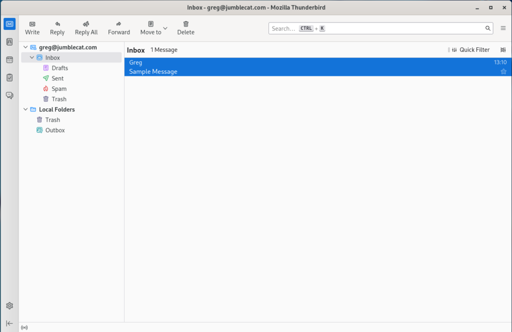
Out of Box Experience

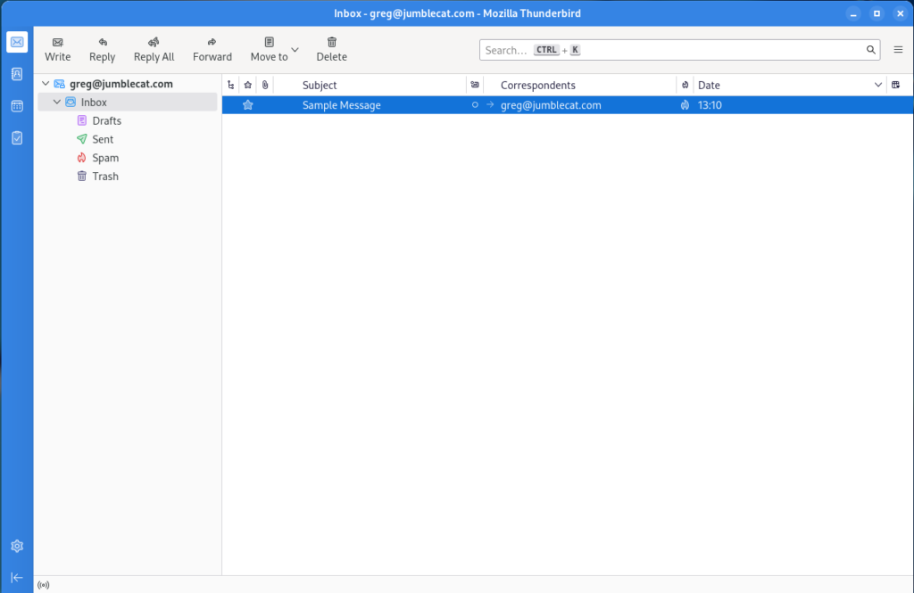
So once you install TB and setup an account, this is what you get:

Which is… fine, but not really all that great, so let’s do some basic changes to get something a little nicer.

Basic Changes

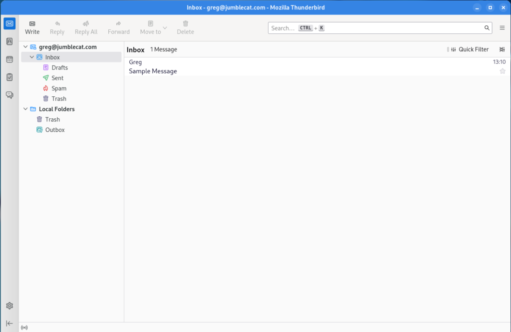
  • Turn off the folder pane header: Open the overflow menu on the folder pane header and select “Hide Folder Pane Header”.
  • Change default search engine: Settings->General->Default Search Engine->Select “DuckDuckGo”.
  • Show the system title bar: Settings->General->Window Layout->Deselect “Hide system window titlebar”.
  • Move messages to their own window: Settings->General->Reading & Display->Open messages in->Select “A new message window” and “Close message window/tab on move or delete”.
  • Turn off the message pane by pressing F8.
  • Remove dynamic spacing for the search box by right click on some empty space and selecting “Customize”, then deleting the dynamic spacer on the right, repeat for each of the toolbar tabs, then click save.
  • Add some toolbar buttons to the main window by once more right clicking on some empty space to the left of the search box and selecting “Customize”, then drag and drop the following items to the left of the dynamic spacer: Write, Reply, Reply All, Forward, Move to, Delete.
  • Before saving, change the “Button style” to “Icons above text”, the click save.
  • Disable data collection: Settings->Privacy & Security->Thunderbird Data Collection and Use->Disable all data collection.

Gradience

As much as I generally like the look of Adwiata on Gnome, the lack of a highlight colour really makes the default colour scheme look washed out to me.

Gradience comes to the rescue here and lets you add some colour to hightlight the theme a bit.

Once you install Gradience, follow the setup tutorial, and make sure to install the GTK3 Adwiata theme as well. You’ll need to activate it in Gnome Tweaks after installing it as the legeacy theme.

Once that is done you can make a couple simple changes to the Adwiata theme in Gradience:

  • Go to the “Header Bar Colors” section.
  • Change “Background Color” to the middle blue.
  • Change “Foreground Color” to white.
  • Apply the changes and save it if you like.

Once done, logout and back in to apply the changes properly.

Spaces

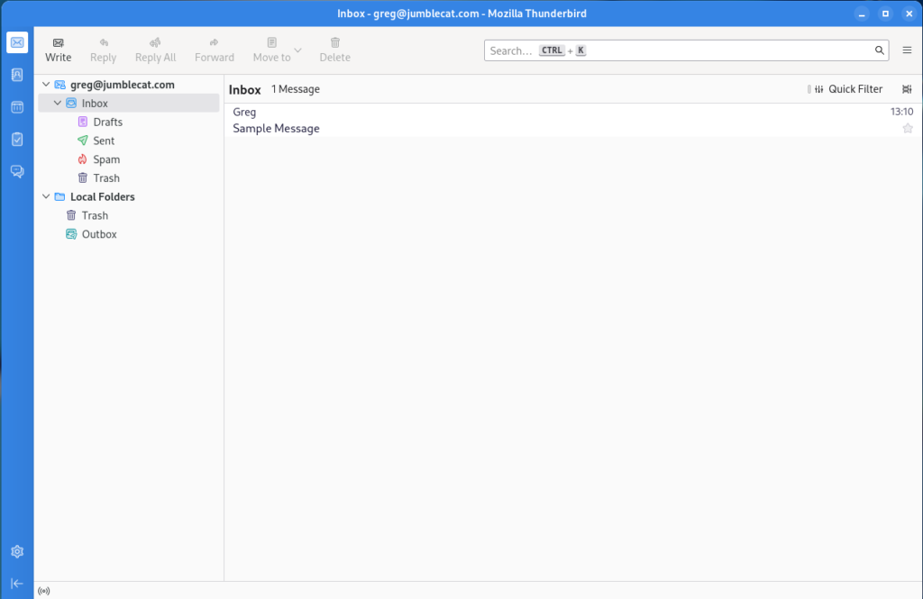
The Spaces toolbar on the left isn’t too bad, but it looks a little out of place, so let’s customize it a bit:

  • Right click on an empty bar of the toolbar and select “Customize”.
  • Set the “Background colour” to match the blue you set in Gradience.
  • Set the “Button colour” to white.
  • Set the “Selected button background color” to white.
  • Set the “Selected button color” to match the blue you set in Gradience.
  • Click done.

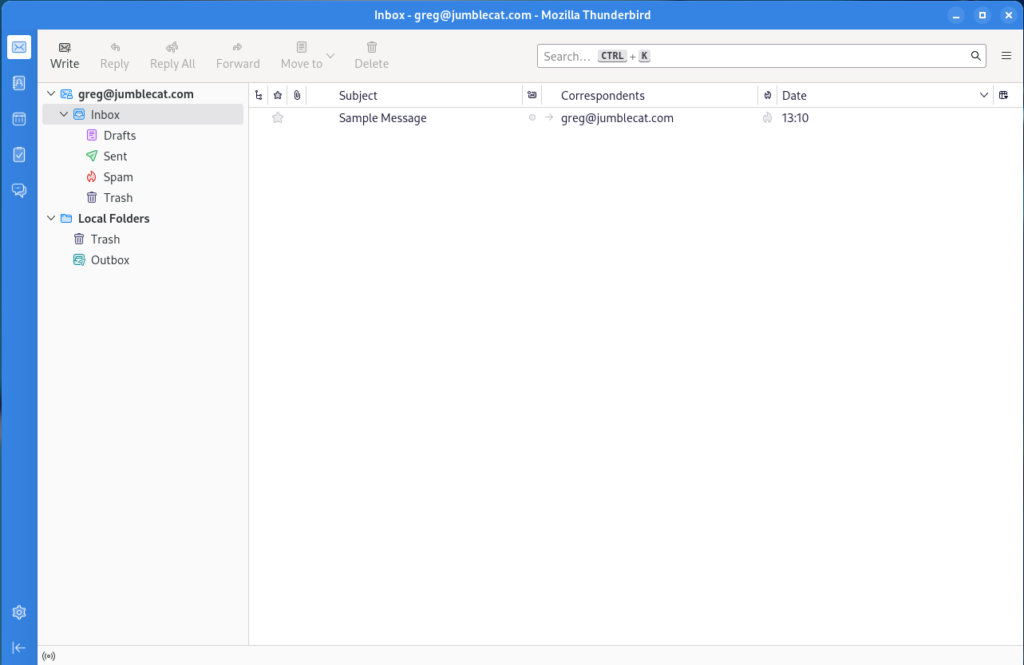
Message List

Let’s make a few minor changes to the message list as well:

  • Go to the message list header row and click the “Message list display options” button on the far right, then select “Table View”.
  • Go back to the same menu and select “Hide Message List Header”.

Disable Chat

So I don’t use Thunderbird as a chat client, and having the chat icon on the Spaces toolbar is kinda annoying, so let’s remove it and disable chat entirely:

  • Go to Settings->General->Config Editor (located at bottom of page).
  • In the search box enter “mail.chat.enabled”, double click the option below so that the setting is “false”.
  • Restart Thunderbird.

Message Window

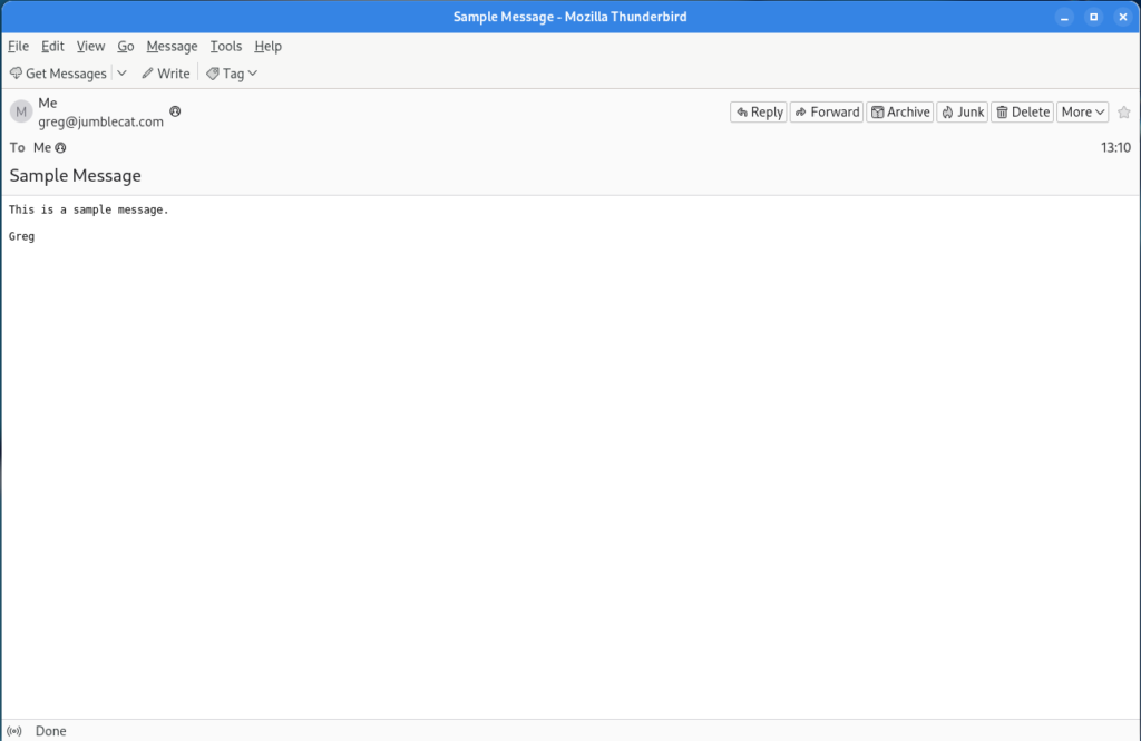
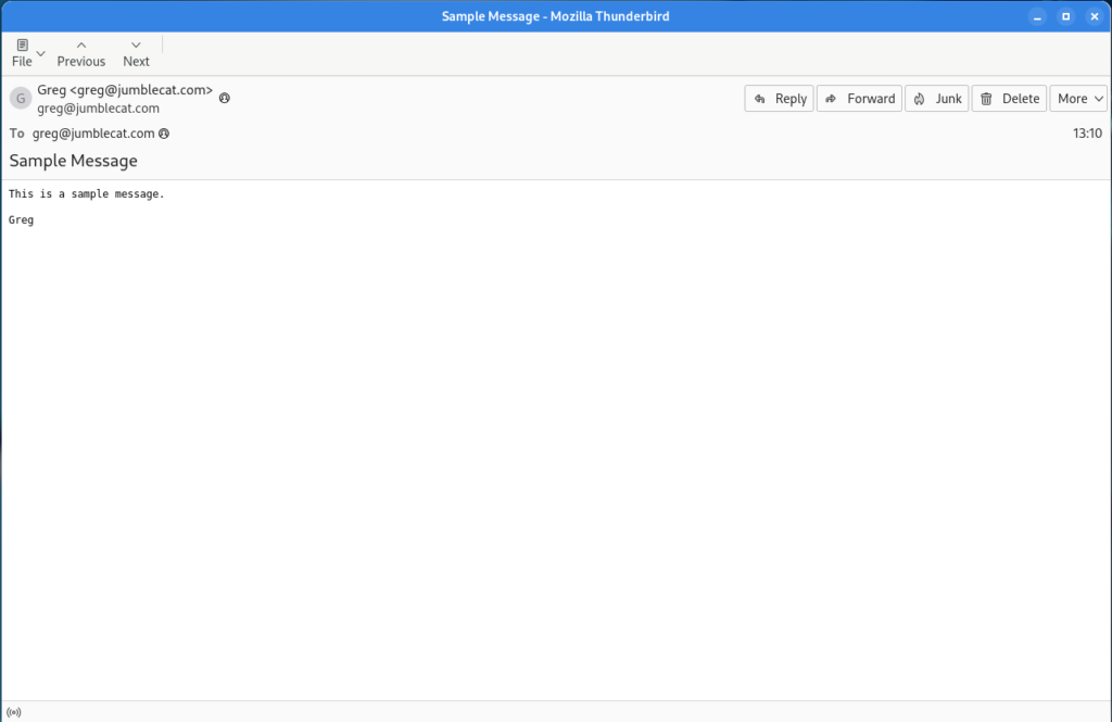
Ok, that’s got the main window looking pretty good, let’s do some changes to the mail window. At the moment it should be looking something like this:

Let’s get it matching the main window a little better:

  • Right click on an empty part of the toolbar and select “Customize”.
  • Change the “Show” option to “Icons and Text”.
  • Add the File, Previous, and Next buttons to the menu.
  • Remove the “Get Messages”, Write, and Tag items.
  • Click Done.
  • Right click on an empty part of the menubar and deselect “Menu Bar “.
  • Show full names: Settings->General->Reading & Display->Display name: deselect “Show only display name for people in my address book”.

Extensions

Ok, so that’s all we can do with the built-in settings, so now it’s time to add some features through extensions. We’re going to be installing and using four extensions:

The first three require no configuration, so they’re pretty much install and use, the last does require some additional config.

No tabs is my favourite new extension for Thunderbird, basically when Thunderbird opens what would be a new tab, it closes the previous tab so that your Thunderbird interface never shows the tab bar.

Ok, so now we can go back over to the message window customize the Message Header Toolbar:

  • On the toolbar, select the “More” menu and then “Customize Toolbar”.
  • Select “Archvie” and click “Hide”.
  • Select “Starred” and click “Hide”.
  • Change the “Button Size” to “Large”.
  • Click Close.

BirdTray

One of the issues with Thunderbird on Linux has always been the lack of a notification tray icon, Birdtray fixes that issue and is a flatpak to boot.

It has lots of configuration items on how to do the notifications, so customize it to your hearts content.

Final Results

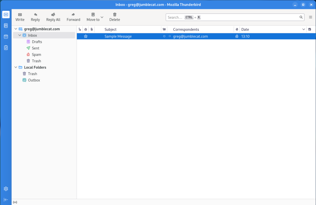
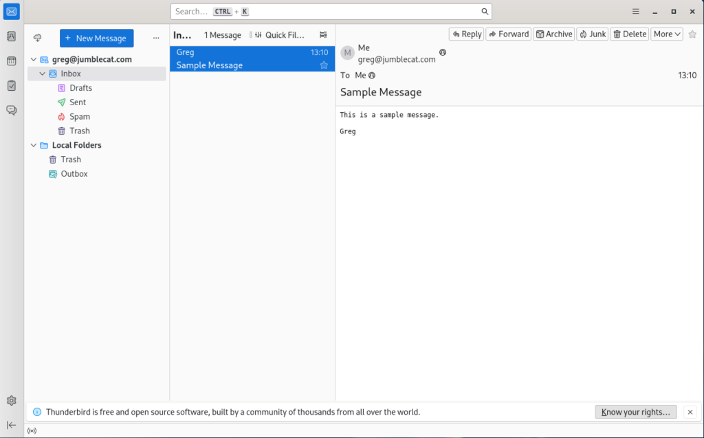
Ok, we now have a main window that looks like this:

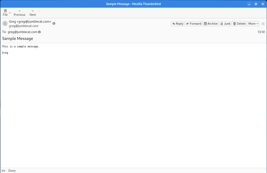
And a message window that looks like this:

Overall not too bad, but there are a few things that could be better.

Future Improvements

  • In pre-Supernova versions of Thunderbird, you could move the “Message Header” buttons to the main message window toolbar, that is no longer possible. It would be nice to bring that functionality back at some point so you could hide the Message Header Toolbar completely.
  • Much like above, the message window no longer has the main menu dropdown on the right of the toolbar, so if you want to access any of the window menu items you have to pop up the menu bar by tapping the alt key.
  • Speaking of the main menu dropdown, it can’t be moved, it is stuck on the right hand side.
  • Some of the sub-toolbars, like in Contacts, can’t be customized at all, so they’re stuck with “Text beside icons” and no ability to add or remove them.
  • The Density option is not granular enough. For example, I’d like the normal density for the majority of the interface, but the message/folder list could really stand a little more padding.

Final Thoughts

Supernova is a big step forward for Thunderbird, and I’ve been quite happy with it overall. There are, as noted above, a few things that could still be improved, and hopefully they will be in future releases.

If you’re looking for a mail client, I’d highly recommend it.

Improving Thunderbird on Linux

linux-category-inverted

As it should be apparent by now, I’ve completely moved off of Windows and moved to Linux for my servers and desktops.  As part of that move I had to find a new mail client, as Outlook has been my go to app for years.

The obvious choice is Thunderbird, its cross-platform and is mature, supporting everything I need, including contacts and calendar from NextCloud.

Unfortunately, the default configuration of Thunderbird on Linux looks a little… well.. terrible to be honest:

This might have been acceptable 10 years ago, but in comparison to a modern version of Outlook, it’s hard to take that big of step backwards.

But what if it could look like this instead:

Well that looks a little better doesn’t it?

To accomplish this there are several steps/requirements:

  • You must be using Thunderbird 60 or above.
  • You have to be comfortable editing TB’s advanced settings.
  • You have to install a custom theme/add-on.
  • You have to customize the toolbars.
  • And add a few extensions and other settings as well.

So here’s each step broken down.

Note: This guide is for Linux, but all of the below customizations should work on Windows as well, but I haven’t tested them so try at your own risk.

Install Thunderbird 60

I’m not going to go in to any detail on this, your distro will probably already have a package all ready for you, so either go to your software store or command line and download it.

If you’re not sure which version is installed, just go to the Thunderbird Menu -> Help -> About dialog and it will be there for you.

Hiding the Application Title Bar

One of the most annoying things about Thunderbird and Firefox is that on Linux, by default, they don’t use client side decorations (the min/max/close buttons) and therefore require the application title bar to be present, wasting screen real estate.

For Firefox, there’s a simple check mark in the customization screen to either enable or disable the title bar, but Thunderbird for some reason decided not to add that.  It still has the functionality, just not the UI to make it easy to enable.

So, as per this helpful article, do the following:

  1. Go to the Thunderbird Menu
  2. Select Preferences -> Preferences
  3. Select the Advanced tab and the General sub tab
  4. Click the Config Editor button near the bottom
  5. If this is your first time running it, accept the warning and tell it to go away for good 😉
  6. In the search field, enter (without the quotes) “mail.tabs.drawInTitlebar”
  7. Double click on the preference name in the list below and Thunderbird should now be titleless (you may need a restart if it isn’t)

Adding A New Theme

This is a little tricky, because if you’ve ever added a theme before, we’re not going to do it that way.

Instead, what we’re really going to do is add an extension:

  1. Go to the Thunderbird Menu
  2. Selection Add-ons -> Add-ons (the add-on manager should be displayed)
  3. In the left had menu, select Extensions
  4. In the search field at the top right, enter “Monterail” (again, without the quotes)
  5. Three items should show up in a new tab:
    1. Monterail (a blue coloured theme, but has some issues with add-ons like Lightning due to contrast)
    2. Moterail Dark (the version I used in the screen shot above)
    3. Monterail Full Dark (makes the message list background dark as well)
  6. Select “Add to Thunderbird” for the theme you want to use
  7. Restart Thunderbird

When Thunderbird restarts it will be using the selected theme, and if you go to the add-ons page you’ll notice that there is no extension that matches the new theme, but instead it is listed under Themes.

Customize Your Toolbars

This is probably the easiest part of this change, but the most tedious as well, all of the below are optional and you may select which ones you want to add, step one is to open the customizer by right clicking on the toolbar and select Customize, then:

  • Move the Thunderbird menu all the way to the left
  • Add a divider between the Thunderbird menu and the first item
  • Remove the Get Messages, Chat, Address Book, Tag, and Quick Filter buttons.
  • Add Reply, Reply All, and Forward buttons
  • Add another divider
  • Add the File and Delete buttons
  • Add a divider
  • Add the Print button
  • Add a divider
  • On the right of the search bar, add a spacer

Once that is done, at the bottom of the customizer window should be a “Show:” combo box, select “Icons and Text” and then close the customizer.

Now, go and open and e-mail and repeat pretty much all of the above and remove the duplice buttons below the message toolbar as well 😉

Extensions And Other Settings

In addition to the above, there are a few other extensions you may want to use:

  • Hide Local Folders: By default Thunderbird shows some local folders to support POP accounts, but if you don’t have any, they’re redundant so this extension hides them from the list.
  • FireTray: Thunderbird doesn’t have a very good way of showing new mail, this extension adds a gnome tray icon which you can customize.  unfortunately FireTray hasn’t been updated for Thunderbird 60 support yet (and may never be), fortunately someone else has forked it and updated.  unfortunately it’s not in the Thunderbird Extension store yet, you’ll have to grab it from the GitHub Repo directly.
  • LookOut (fixed version): If you’re sending messages back and forth with Outlook users, this will add support for Microsoft’s proprietary message extensions.
  • CardBook: For getting your contacts from NextCloud or other CardDAV servers.
  • Lightning: For getting your calendar from NextCloud or other CalDAV servers.

There are a few other settings you might consider:

  • Hide the message pane via Menu -> Preferences -> Layout -> Message Pane
  • Hide the Quick Filter bar, either by clicking the button before you remove it above or via Menu -> Preferences -> Quick Filter Bar
  • Open messages in a new window via Menu -> Preferences -> Display -> Advanced
  • Close message window on move delete is the same place as above
  • Disable the crash reporter via Menu -> Preferences -> Advanced -> Data Choices

What Else Could Be Improved?

After you finish with the above, you’ll have a much better Thunderbird experience than you get out of the box, but it’s not perfect:

  • The message list is from the 90’s (ok, maybe the 2000’s).  Specifically each field is one column in the list, which makes poor use of the horizontal space.  Outlook moved away from this years ago.  Unfortunately we’re going to have to wait for Thunderbird to fix it themselves as the research I did seems to be pretty clear an add-on can’t fix this.
  • When you compose a message, you get the full, ugly drop down menu at the top of the window.  I did find a plugin that hides it, but not until after it’s been displayed so I don’t think that’s better.
  • The hamburder menu is ugly, this isn’t specific to Thunderbird, I just think all hamburger menus are ugly.  The “blue” Monterail theme does replace it with a little Thunderbird logo, so it is possible to change, but it looks like a complete new theme is required to do so.
  • Remove the tabs.  I know most people like them, and for a web browser they probably make sense, but for a mail client they just rub me the wrong way.  Being able to disable them would be nice but I don’t expect it to happen.

And that’s it… happy Thunderbirding!