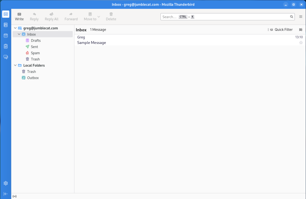
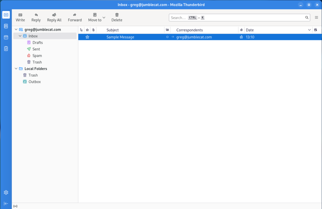
Thunderbird Supernova

linux-category-inverted

Happy new year! I guess it’s time to post something to by blog again, I have a few items to get caught up on (I can’t promise a regular schedule though), but the first one is Thunderbird 115.

The Supernova release came out a while ago and so I think it’s time to update my Thunderbird configuration post from a few years ago.

Flatpaks

First things first, since my last post, flatpaks have become a thing… a big thing for me at least. I attempt to install the flatpak version of any software I can.

This is for a couple of reasons, the first being that most distro’s are pretty far behind the actual latest release for any given piece of software. Flatpaks fix this problem by always having the latest version available and working across any distribution you are using.

Out of Box Experience

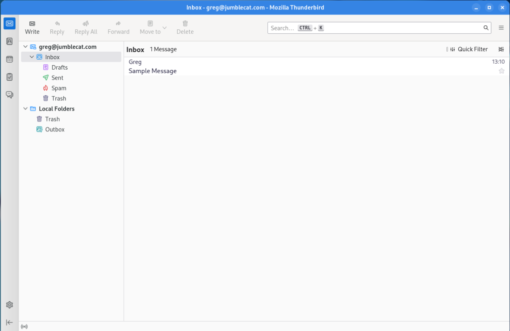
So once you install TB and setup an account, this is what you get:
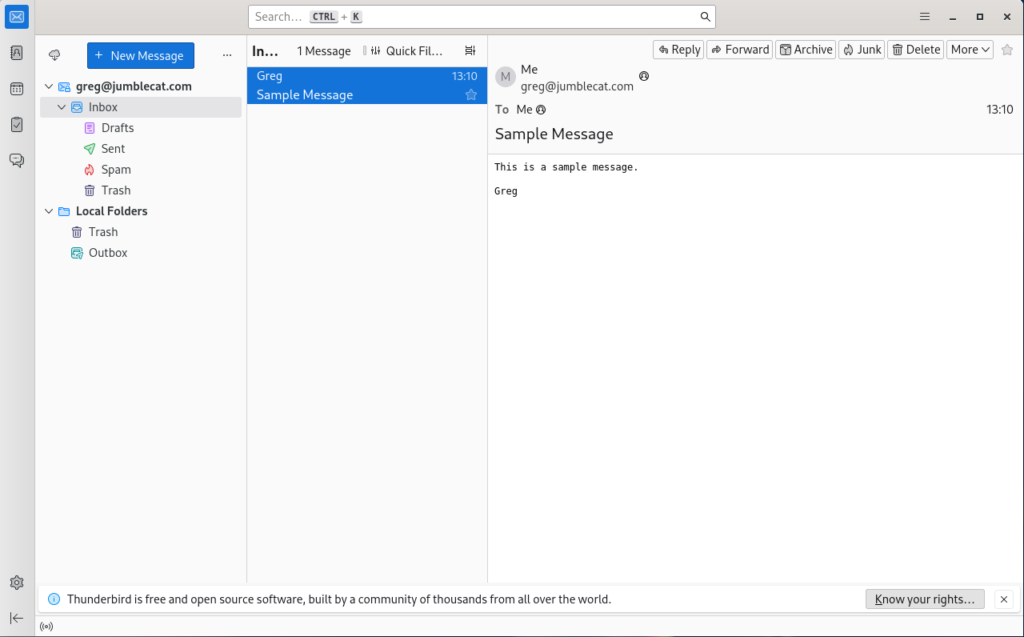
Which is… fine, but not really all that great, so let’s do some basic changes to get something a little nicer.

Basic Changes

  • Turn off the folder pane header: Open the overflow menu on the folder pane header and select “Hide Folder Pane Header”.
  • Change default search engine: Settings->General->Default Search Engine->Select “DuckDuckGo”.
  • Show the system title bar: Settings->General->Window Layout->Deselect “Hide system window titlebar”.
  • Move messages to their own window: Settings->General->Reading & Display->Open messages in->Select “A new message window” and “Close message window/tab on move or delete”.
  • Turn off the message pane by pressing F8.
  • Remove dynamic spacing for the search box by right click on some empty space and selecting “Customize”, then deleting the dynamic spacer on the right, repeat for each of the toolbar tabs, then click save.
  • Add some toolbar buttons to the main window by once more right clicking on some empty space to the left of the search box and selecting “Customize”, then drag and drop the following items to the left of the dynamic spacer: Write, Reply, Reply All, Forward, Move to, Delete.
  • Before saving, change the “Button style” to “Icons above text”, the click save.
  • Disable data collection: Settings->Privacy & Security->Thunderbird Data Collection and Use->Disable all data collection.
Gradience

As much as I generally like the look of Adwiata on Gnome, the lack of a highlight colour really makes the default colour scheme look washed out to me.

Gradience comes to the rescue here and lets you add some colour to hightlight the theme a bit.

Once you install Gradience, follow the setup tutorial, and make sure to install the GTK3 Adwiata theme as well. You’ll need to activate it in Gnome Tweaks after installing it as the legeacy theme.

Once that is done you can make a couple simple changes to the Adwiata theme in Gradience:

  • Go to the “Header Bar Colors” section.
  • Change “Background Color” to the middle blue.
  • Change “Foreground Color” to white.
  • Apply the changes and save it if you like.

Once done, logout and back in to apply the changes properly.
Spaces

The Spaces toolbar on the left isn’t too bad, but it looks a little out of place, so let’s customize it a bit:

  • Right click on an empty bar of the toolbar and select “Customize”.
  • Set the “Background colour” to match the blue you set in Gradience.
  • Set the “Button colour” to white.
  • Set the “Selected button background color” to white.
  • Set the “Selected button color” to match the blue you set in Gradience.
  • Click done.

Message List

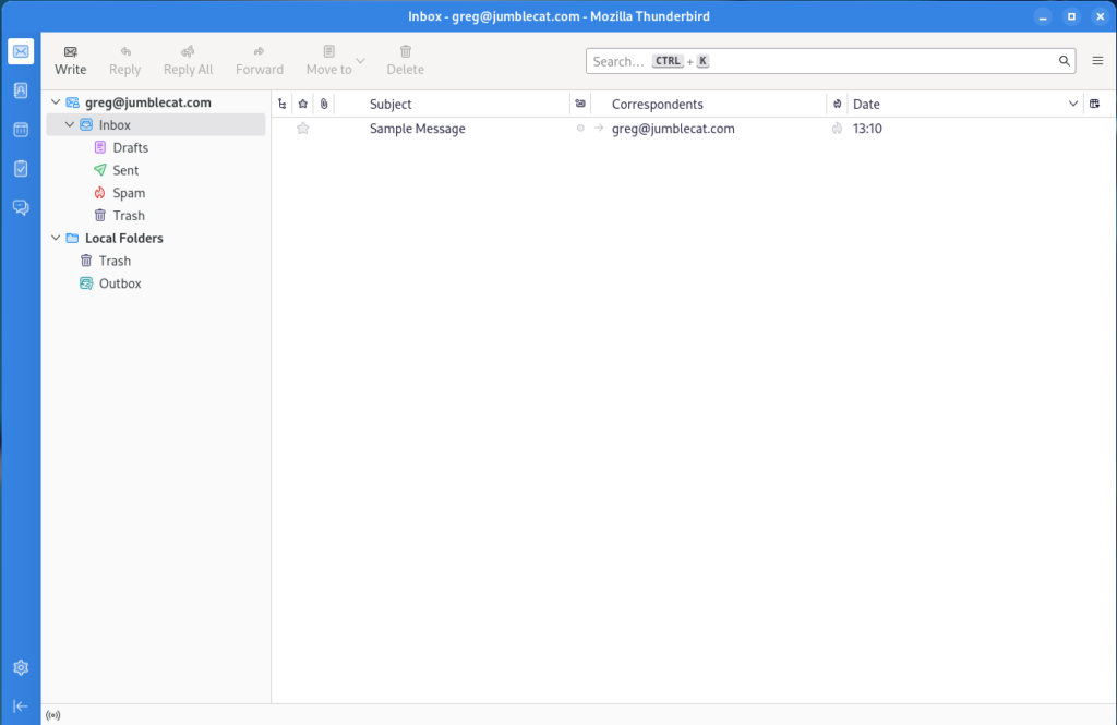
Let’s make a few minor changes to the message list as well:

  • Go to the message list header row and click the “Message list display options” button on the far right, then select “Table View”.
  • Go back to the same menu and select “Hide Message List Header”.
Disable Chat

So I don’t use Thunderbird as a chat client, and having the chat icon on the Spaces toolbar is kinda annoying, so let’s remove it and disable chat entirely:

  • Go to Settings->General->Config Editor (located at bottom of page).
  • In the search box enter “mail.chat.enabled”, double click the option below so that the setting is “false”.
  • Restart Thunderbird.

Message Window

Ok, that’s got the main window looking pretty good, let’s do some changes to the mail window. At the moment it should be looking something like this:
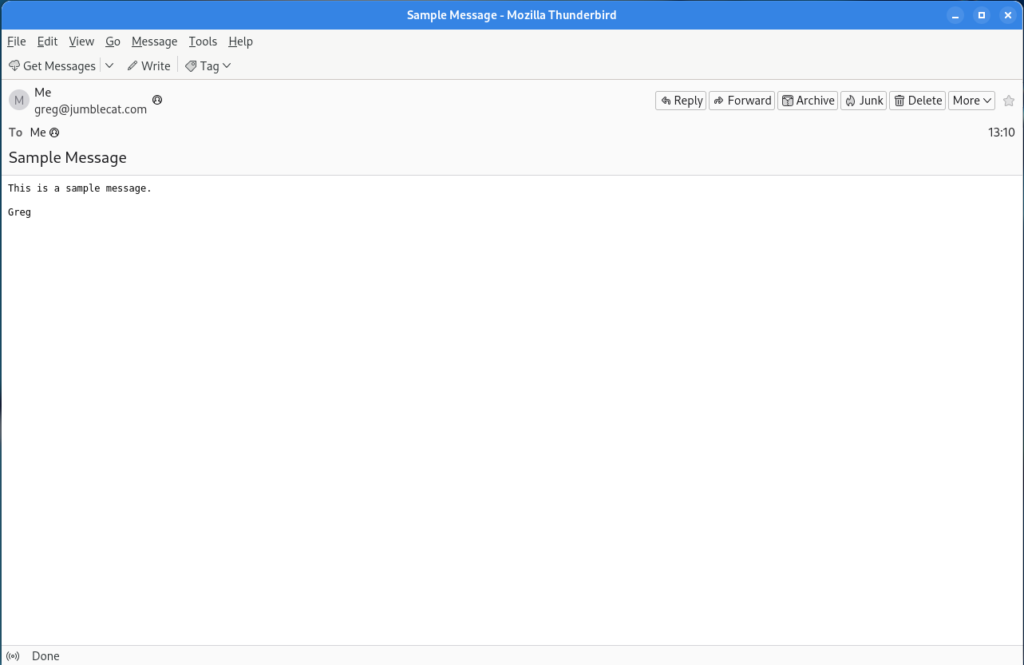
Let’s get it matching the main window a little better:

  • Right click on an empty part of the toolbar and select “Customize”.
  • Change the “Show” option to “Icons and Text”.
  • Add the File, Previous, and Next buttons to the menu.
  • Remove the “Get Messages”, Write, and Tag items.
  • Click Done.
  • Right click on an empty part of the menubar and deselect “Menu Bar “.
  • Show full names: Settings->General->Reading & Display->Display name: deselect “Show only display name for people in my address book”.
Extensions

Ok, so that’s all we can do with the built-in settings, so now it’s time to add some features through extensions. We’re going to be installing and using four extensions:

The first three require no configuration, so they’re pretty much install and use, the last does require some additional config.

No tabs is my favourite new extension for Thunderbird, basically when Thunderbird opens what would be a new tab, it closes the previous tab so that your Thunderbird interface never shows the tab bar.

Ok, so now we can go back over to the message window customize the Message Header Toolbar:

  • On the toolbar, select the “More” menu and then “Customize Toolbar”.
  • Select “Archvie” and click “Hide”.
  • Select “Starred” and click “Hide”.
  • Change the “Button Size” to “Large”.
  • Click Close.

BirdTray

One of the issues with Thunderbird on Linux has always been the lack of a notification tray icon, Birdtray fixes that issue and is a flatpak to boot.

It has lots of configuration items on how to do the notifications, so customize it to your hearts content.

Final Results

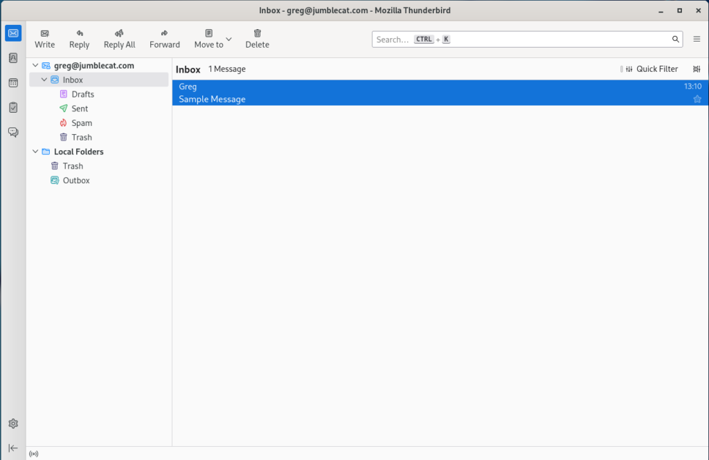
Ok, we now have a main window that looks like this:
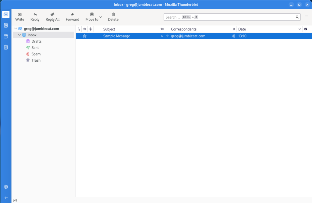
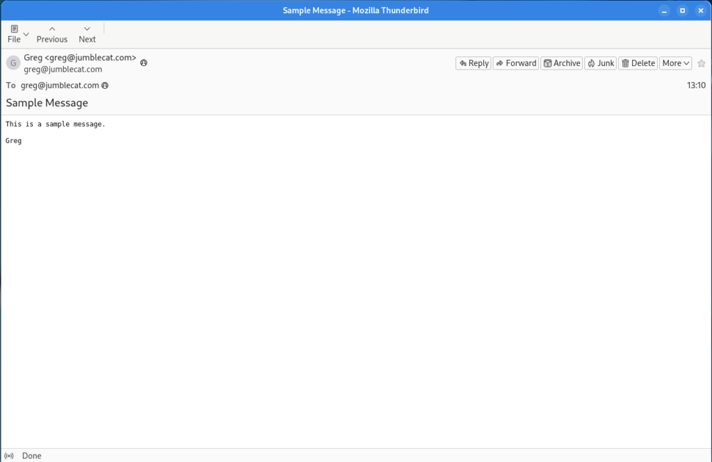
And a message window that looks like this:
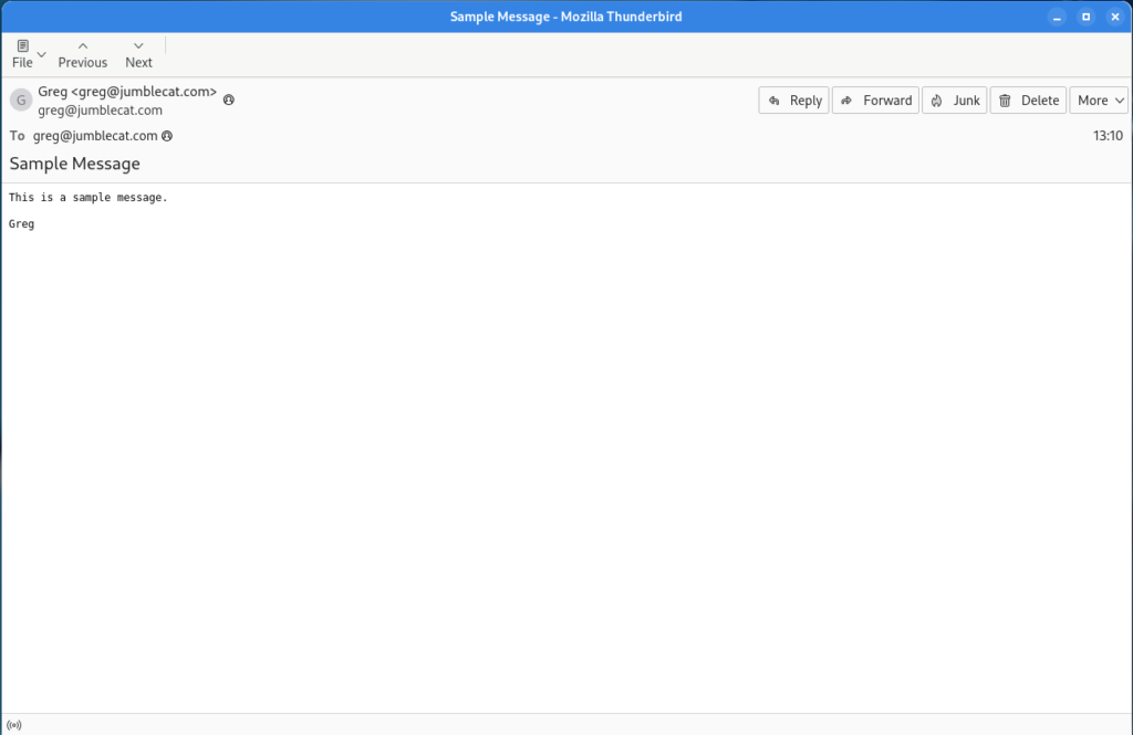
Overall not too bad, but there are a few things that could be better.

Future Improvements

  • In pre-Supernova versions of Thunderbird, you could move the “Message Header” buttons to the main message window toolbar, that is no longer possible. It would be nice to bring that functionality back at some point so you could hide the Message Header Toolbar completely.
  • Much like above, the message window no longer has the main menu dropdown on the right of the toolbar, so if you want to access any of the window menu items you have to pop up the menu bar by tapping the alt key.
  • Speaking of the main menu dropdown, it can’t be moved, it is stuck on the right hand side.
  • Some of the sub-toolbars, like in Contacts, can’t be customized at all, so they’re stuck with “Text beside icons” and no ability to add or remove them.
  • The Density option is not granular enough. For example, I’d like the normal density for the majority of the interface, but the message/folder list could really stand a little more padding.

Final Thoughts

Supernova is a big step forward for Thunderbird, and I’ve been quite happy with it overall. There are, as noted above, a few things that could still be improved, and hopefully they will be in future releases.

If you’re looking for a mail client, I’d highly recommend it.

Improving Thunderbird on Linux

linux-category-inverted

As it should be apparent by now, I’ve completely moved off of Windows and moved to Linux for my servers and desktops.  As part of that move I had to find a new mail client, as Outlook has been my go to app for years.

The obvious choice is Thunderbird, its cross-platform and is mature, supporting everything I need, including contacts and calendar from NextCloud.

Unfortunately, the default configuration of Thunderbird on Linux looks a little… well.. terrible to be honest:

This might have been acceptable 10 years ago, but in comparison to a modern version of Outlook, it’s hard to take that big of step backwards.

But what if it could look like this instead:

Well that looks a little better doesn’t it?

To accomplish this there are several steps/requirements:

  • You must be using Thunderbird 60 or above.
  • You have to be comfortable editing TB’s advanced settings.
  • You have to install a custom theme/add-on.
  • You have to customize the toolbars.
  • And add a few extensions and other settings as well.

So here’s each step broken down.

Note: This guide is for Linux, but all of the below customizations should work on Windows as well, but I haven’t tested them so try at your own risk.

Install Thunderbird 60

I’m not going to go in to any detail on this, your distro will probably already have a package all ready for you, so either go to your software store or command line and download it.

If you’re not sure which version is installed, just go to the Thunderbird Menu -> Help -> About dialog and it will be there for you.

Hiding the Application Title Bar

One of the most annoying things about Thunderbird and Firefox is that on Linux, by default, they don’t use client side decorations (the min/max/close buttons) and therefore require the application title bar to be present, wasting screen real estate.

For Firefox, there’s a simple check mark in the customization screen to either enable or disable the title bar, but Thunderbird for some reason decided not to add that.  It still has the functionality, just not the UI to make it easy to enable.

So, as per this helpful article, do the following:

  1. Go to the Thunderbird Menu
  2. Select Preferences -> Preferences
  3. Select the Advanced tab and the General sub tab
  4. Click the Config Editor button near the bottom
  5. If this is your first time running it, accept the warning and tell it to go away for good 😉
  6. In the search field, enter (without the quotes) “mail.tabs.drawInTitlebar”
  7. Double click on the preference name in the list below and Thunderbird should now be titleless (you may need a restart if it isn’t)

Adding A New Theme

This is a little tricky, because if you’ve ever added a theme before, we’re not going to do it that way.

Instead, what we’re really going to do is add an extension:

  1. Go to the Thunderbird Menu
  2. Selection Add-ons -> Add-ons (the add-on manager should be displayed)
  3. In the left had menu, select Extensions
  4. In the search field at the top right, enter “Monterail” (again, without the quotes)
  5. Three items should show up in a new tab:
    1. Monterail (a blue coloured theme, but has some issues with add-ons like Lightning due to contrast)
    2. Moterail Dark (the version I used in the screen shot above)
    3. Monterail Full Dark (makes the message list background dark as well)
  6. Select “Add to Thunderbird” for the theme you want to use
  7. Restart Thunderbird

When Thunderbird restarts it will be using the selected theme, and if you go to the add-ons page you’ll notice that there is no extension that matches the new theme, but instead it is listed under Themes.

Customize Your Toolbars

This is probably the easiest part of this change, but the most tedious as well, all of the below are optional and you may select which ones you want to add, step one is to open the customizer by right clicking on the toolbar and select Customize, then:

  • Move the Thunderbird menu all the way to the left
  • Add a divider between the Thunderbird menu and the first item
  • Remove the Get Messages, Chat, Address Book, Tag, and Quick Filter buttons.
  • Add Reply, Reply All, and Forward buttons
  • Add another divider
  • Add the File and Delete buttons
  • Add a divider
  • Add the Print button
  • Add a divider
  • On the right of the search bar, add a spacer

Once that is done, at the bottom of the customizer window should be a “Show:” combo box, select “Icons and Text” and then close the customizer.

Now, go and open and e-mail and repeat pretty much all of the above and remove the duplice buttons below the message toolbar as well 😉

Extensions And Other Settings

In addition to the above, there are a few other extensions you may want to use:

  • Hide Local Folders: By default Thunderbird shows some local folders to support POP accounts, but if you don’t have any, they’re redundant so this extension hides them from the list.
  • FireTray: Thunderbird doesn’t have a very good way of showing new mail, this extension adds a gnome tray icon which you can customize.  unfortunately FireTray hasn’t been updated for Thunderbird 60 support yet (and may never be), fortunately someone else has forked it and updated.  unfortunately it’s not in the Thunderbird Extension store yet, you’ll have to grab it from the GitHub Repo directly.
  • LookOut (fixed version): If you’re sending messages back and forth with Outlook users, this will add support for Microsoft’s proprietary message extensions.
  • CardBook: For getting your contacts from NextCloud or other CardDAV servers.
  • Lightning: For getting your calendar from NextCloud or other CalDAV servers.

There are a few other settings you might consider:

  • Hide the message pane via Menu -> Preferences -> Layout -> Message Pane
  • Hide the Quick Filter bar, either by clicking the button before you remove it above or via Menu -> Preferences -> Quick Filter Bar
  • Open messages in a new window via Menu -> Preferences -> Display -> Advanced
  • Close message window on move delete is the same place as above
  • Disable the crash reporter via Menu -> Preferences -> Advanced -> Data Choices

What Else Could Be Improved?

After you finish with the above, you’ll have a much better Thunderbird experience than you get out of the box, but it’s not perfect:

  • The message list is from the 90’s (ok, maybe the 2000’s).  Specifically each field is one column in the list, which makes poor use of the horizontal space.  Outlook moved away from this years ago.  Unfortunately we’re going to have to wait for Thunderbird to fix it themselves as the research I did seems to be pretty clear an add-on can’t fix this.
  • When you compose a message, you get the full, ugly drop down menu at the top of the window.  I did find a plugin that hides it, but not until after it’s been displayed so I don’t think that’s better.
  • The hamburder menu is ugly, this isn’t specific to Thunderbird, I just think all hamburger menus are ugly.  The “blue” Monterail theme does replace it with a little Thunderbird logo, so it is possible to change, but it looks like a complete new theme is required to do so.
  • Remove the tabs.  I know most people like them, and for a web browser they probably make sense, but for a mail client they just rub me the wrong way.  Being able to disable them would be nice but I don’t expect it to happen.

And that’s it… happy Thunderbirding!


Facebook No More

[sc:internet-category ]I’ve had an apathy/hate relationship with Facebook over the years, I’m not one who tends to post every little thing or have a thousand “friends” so it didn’t hold much interest for me overall.

Of course I signed up for it and used it for a while, but in the end it was time to subscribe.

I still wasn’t sure I wanted to.  Everyone uses it, do I really want to leave?

So I jus disabled my account and let it sit a while.  A year later I hadn’t missed it at all.

A few months ago, I submitted the deletion request and now it’s gone.

And you know what?

I don’t miss it at all.

Something a little off topic… Traveling

[sc:bitbucket-category ]I recently took a trip to Vegas for a quick vacation and three things kind of stuck out for me:

  1. My phone
  2. Hotel WiFi
  3. The rental car

My Phone

I used off airport parking and dropped my car off in lots of time, I then grabbed the shuttle to the airport, checked in and went to US Customs.  At which point I realized I’d left my phone in my car!

It’s amazing how dependent on our phones we’ve become and as I’d gotten to the airport with lots of time to spare, I had enough time to go back to my car and get it.

But it could certainly been a very different story.  I don’t know if I’d have survived without it for almost a week 🙂

Hotel WiFi

Staying on the Vegas strip in a major hotel chain provides certain advantages, Internet access being one of them.

On previous trips to this hotel there two options for Internet access, WiFi and wired.  I’d normally used the wired connection and brought a mini router with me to share it out to my other devices.

This time, the wired connection was gone and WiFi was all that was left.

The WiFi signal was strong but was limited to two devices, which was a little annoying, but not a show stopper.

The real problem was whatever proxy they had set up was messing with the HTTP headers and half the sites I’d visited seemed to think I was running IE on XP and warning me to upgrade.

A quick test by connecting to my VPN at home proved this out as browsing was fine after that.

One day we won’t have to deal with that kind of crappy access, but it seems a long way off every time I take a trip.

The Rental Car

I picked up a rental car and decided to upgrade to a Dodge Challenger.  The looks of the car are amazing but sitting in it really felt tight, almost claustrophobic.  I’m not a tall person and I hit my head several times getting in and out of it.

And visibility out of it was atrocious.

If really shows how a design can look great but not be particularly user-friendly.


GoDaddy hosting and PHP’s max execution time

[sc:internet-category ]A friend of mine is using GoDaddy hosting to server up a WordPress site and he was having issues with GoDaddy killing his process after 120 seconds.

He was using the shared hosting option and GoDaddy by default limits scripts so they don’t waste processing power.  However the documentation from GoDaddy is kind of vauge and actual implementation was different and in the end didn’t really work.

Here’s what they say to do, create a php5.ini file in your root hosting directory and add the configuration directive.

If you then run phpinfo(), you see the time limit has been increased.  However if you run a script you’ll find it still terminates after 120 seconds.

Adding both a php.ini AND a php5.ini works better and extends the time limit slightly, but still after about 150 seconds the script times out.

There seems to be a system wide limit, which I can’t really blame them for, on scripts.  It’s not something most people will run in to, but there are a few situations where it can be a real nuisance.